
FlexboxLayout
FlexboxLayout is a flexible box layout that arranges its children in rows or columns with automatic wrapping.
It implements a CSS Flexbox-like layout model suitable for creating flexible, responsive UIs.
Use FlexboxLayout when the items should wrap: items that don’t fit continue on the next line.
That’s why flex-wrap defaults to wrap, unlike CSS.
For a single row or column, use the simpler and faster
HorizontalLayout or VerticalLayout instead,
unless you need a flex-direction that changes at runtime,
or the reversed directions (row-reverse / column-reverse).
// This example demonstrates FlexboxLayout with row direction (default)export component Foo inherits Window { width: 300px; height: 150px; FlexboxLayout { spacing: 8px; padding: 8px; flex-direction: row; Rectangle { background: red; width: 60px; height: 50px; } Rectangle { background: blue; width: 60px; height: 50px; } Rectangle { background: yellow; width: 60px; height: 50px; } Rectangle { background: green; width: 60px; height: 50px; } Rectangle { background: purple; width: 60px; height: 50px; } }}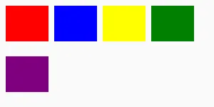
// This example demonstrates FlexboxLayout with column directionexport component Foo inherits Window { width: 200px; height: 300px; FlexboxLayout { spacing: 8px; padding: 8px; flex-direction: column; Rectangle { background: red; width: 50px; height: 60px; } Rectangle { background: blue; width: 50px; height: 60px; } Rectangle { background: yellow; width: 50px; height: 60px; } Rectangle { background: green; width: 50px; height: 60px; } Rectangle { background: purple; width: 50px; height: 60px; } }}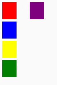
Overview
Section titled “Overview”In row direction, items are placed from left to right. When the available width is exceeded, items automatically wrap to the next row. In column direction, items are placed from top to bottom and wrap to the next column when the available height is exceeded.
Spacing Properties
Section titled “Spacing Properties”spacing
Section titled “spacing”lengthdefault: 0px
The distance between the elements in the layout. CSS Flexbox usually calls this “gap”, but “spacing” is used in Slint for consistency with other layout types. This single value is applied as both horizontal and vertical spacing between items.
To target specific directions with different values use the following properties:
spacing-horizontal
Section titled “spacing-horizontal”lengthdefault: 0px
The horizontal distance between items in the layout. CSS Flexbox calls this “column-gap”.
spacing-vertical
Section titled “spacing-vertical”lengthdefault: 0px
The vertical distance between items in the layout. CSS Flexbox calls this “row-gap”.
Padding Properties
Section titled “Padding Properties”padding
Section titled “padding”lengthdefault: 0px
The padding around the layout as a whole. This single value is applied to all sides.
To target specific sides with different values use the following properties:
padding-left
Section titled “padding-left”lengthdefault: 0px
padding-right
Section titled “padding-right”lengthdefault: 0px
padding-top
Section titled “padding-top”lengthdefault: 0px
padding-bottom
Section titled “padding-bottom”lengthdefault: 0px
Alignment Properties
Section titled “Alignment Properties”alignment
Section titled “alignment”enum LayoutAlignmentdefault: start
Set the alignment of items along the main axis. CSS Flexbox calls this “justify-content”.
With stretch, items grow along the main axis to fill each line,
weighted by their horizontal-stretch (row) or vertical-stretch (column) factor.
When every factor is 0, the free space is split evenly.
Use max-width/max-height to cap an item’s growth;
space a capped item cannot take stays free at the end of the line.
CSS Flexbox expresses this per item with flex-grow instead.
LayoutAlignment
Enum representing the alignment property of a
HorizontalBox, a VerticalBox,
a HorizontalLayout, a VerticalLayout, or a FlexboxLayout,
and the cross-axis-line-alignment property of a FlexboxLayout.
For cross-axis-line-alignment, the values below apply to the flex lines
instead of the elements.
stretch: Foralignment: use the minimum size of all elements in a layout, distribute remaining space based on*-stretchamong all elements. Forcross-axis-line-alignment: the flex lines have no stretch factor and share the remaining space equally.center: Use the preferred size for all elements, distribute remaining space evenly before the first and after the last element.start: Use the preferred size for all elements, put remaining space after the last element.end: Use the preferred size for all elements, put remaining space before the first element.space-between: Use the preferred size for all elements, distribute remaining space evenly between elements.space-around: Use the preferred size for all elements, distribute remaining space evenly between the elements, and use half spaces at the start and end.space-evenly: Use the preferred size for all elements, distribute remaining space evenly before the first element, after the last element and between elements.
Direction Properties
Section titled “Direction Properties”flex-direction
Section titled “flex-direction”enum FlexboxLayoutDirectiondefault: the first enum value
The primary direction in which items are placed. Set to row to place items horizontally left-to-right (default), or column to place items vertically top-to-bottom.
It also supports row-reverse and column-reverse which invert the flow: row-reverse places items right-to-left (starting at the right edge), and column-reverse places items bottom-to-top (starting at the bottom edge).
FlexboxLayoutDirection
The direction in which flex items are placed in a flex container.
row: Items are placed in a row, from left to right.row-reverse: Items are placed in a row in reverse order, from right to left.column: Items are placed in a column, from top to bottom.column-reverse: Items are placed in a column in reverse order, from bottom to top.
cross-axis-line-alignment
Section titled “cross-axis-line-alignment”enum LayoutAlignmentdefault: the first enum value
Set the distribution of flex lines along the cross axis. CSS Flexbox calls this “align-content”;
the name here pairs with cross-axis-alignment, which aligns the items within one line.
The default value is stretch.
LayoutAlignment
Enum representing the alignment property of a
HorizontalBox, a VerticalBox,
a HorizontalLayout, a VerticalLayout, or a FlexboxLayout,
and the cross-axis-line-alignment property of a FlexboxLayout.
For cross-axis-line-alignment, the values below apply to the flex lines
instead of the elements.
stretch: Foralignment: use the minimum size of all elements in a layout, distribute remaining space based on*-stretchamong all elements. Forcross-axis-line-alignment: the flex lines have no stretch factor and share the remaining space equally.center: Use the preferred size for all elements, distribute remaining space evenly before the first and after the last element.start: Use the preferred size for all elements, put remaining space after the last element.end: Use the preferred size for all elements, put remaining space before the first element.space-between: Use the preferred size for all elements, distribute remaining space evenly between elements.space-around: Use the preferred size for all elements, distribute remaining space evenly between the elements, and use half spaces at the start and end.space-evenly: Use the preferred size for all elements, distribute remaining space evenly before the first element, after the last element and between elements.
cross-axis-alignment
Section titled “cross-axis-alignment”enum CrossAxisAlignmentdefault: the first enum value
Set the alignment of individual items along the cross axis within each flex line.
CSS Flexbox calls this “align-items”. The default value is stretch.
CrossAxisAlignment
Controls the alignment of items along the cross axis of a layout.
Used as the cross-axis-alignment property of HorizontalLayout, VerticalLayout,
and FlexboxLayout, and as the cross-axis-self-alignment property of their
children, which overrides the container’s alignment for a single item.
auto: The default: forcross-axis-self-alignment, use the container’scross-axis-alignmentvalue. For an unsetcross-axis-alignmentit is equivalent tostretch; it is an error to set it explicitly there.stretch: Items are stretched to fill the cross axis.start: Items are placed at the start of the cross axis.end: Items are placed at the end of the cross axis.center: Items are centered along the cross axis.
flex-wrap
Section titled “flex-wrap”enum FlexboxLayoutWrapdefault: the first enum value
Controls whether flex items wrap onto multiple lines when they don’t fit in the container.
The default value is wrap, unlike CSS where it is nowrap.
FlexboxLayoutWrap
Controls whether flex items wrap onto multiple lines.
wrap: Flex items wrap onto multiple lines, from top to bottom (for row direction) or left to right (for column direction).no-wrap: All flex items are laid out on a single line (default for CSS, but Slint defaults towrap).wrap-reverse: Flex items wrap onto multiple lines in the reverse direction.
Cell elements
Section titled “Cell elements”Cell elements inside a FlexboxLayout obtain the following new properties:
cross-axis-self-alignment
Section titled “cross-axis-self-alignment”enum CrossAxisAlignmentdefault: auto
Overrides the container’s cross-axis-alignment for this element. CSS Flexbox calls this “align-self”.
The default value auto uses the container’s cross-axis-alignment.
CrossAxisAlignment
Controls the alignment of items along the cross axis of a layout.
Used as the cross-axis-alignment property of HorizontalLayout, VerticalLayout,
and FlexboxLayout, and as the cross-axis-self-alignment property of their
children, which overrides the container’s alignment for a single item.
auto: The default: forcross-axis-self-alignment, use the container’scross-axis-alignmentvalue. For an unsetcross-axis-alignmentit is equivalent tostretch; it is an error to set it explicitly there.stretch: Items are stretched to fill the cross axis.start: Items are placed at the start of the cross axis.end: Items are placed at the end of the cross axis.center: Items are centered along the cross axis.
layout-order
Section titled “layout-order”intdefault: 0
Controls the visual order of the items, like the CSS order property:
items are laid out in ascending order value, and items with the same value keep
their declaration order.
FlexboxLayout { Rectangle { layout-order: 2; } Rectangle { layout-order: 1; } // appears first}Only the visual order changes: keyboard focus still moves in declaration order.
CSS Mapping
Section titled “CSS Mapping”The container properties map to CSS Flexbox as follows:
| CSS | Slint |
|---|---|
flex-direction | flex-direction |
flex-wrap | flex-wrap, but the default is wrap (CSS: nowrap) |
justify-content | alignment |
align-items | cross-axis-alignment |
align-content | cross-axis-line-alignment |
gap | spacing |
column-gap | spacing-horizontal |
row-gap | spacing-vertical |
padding | padding, padding-left / -right / -top / -bottom |
The CSS per-item flexbox properties are expressed with the properties the other layouts already use:
| CSS | Slint |
|---|---|
flex-grow | alignment: stretch on the container, weighted per item by horizontal-stretch / vertical-stretch; max-width / max-height caps growing (space a capped item cannot take stays free) |
flex-shrink | nothing to opt into: every item shrinks, in proportion to its preferred size; min-width / min-height refuses shrinking |
flex-basis | preferred-width (row) / preferred-height (column) |
align-self | cross-axis-self-alignment |
Layout Behavior
Section titled “Layout Behavior”The layouting algorithm for FlexboxLayout is entirely implemented by taffy
You can learn more about the CSS Flexbox specification from
- the Mozilla developer website
- A Complete Guide To Flexbox by CSS Tricks. This is detailed guide with illustrations and comprehensive written explanation of the different Flexbox properties and how they work.
© 2026 SixtyFPS GmbH